

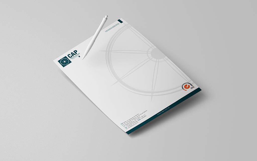
CAP Letterhead Design
Digital Syndrom is proud to have completed the Graphic Design and printing of the CAP letterhead, combining functionality with a touch of creativity to meet their professional needs.
We carefully designed and printed custom letterheads for our client CAP, ensuring they reflect the company’s identity and professionalism. The letterheads were printed on high-quality 80g extra strong paper using a four-color process, perfectly suited for A4-sized documents. These letterheads are designed to enhance CAP’s brand visibility while ensuring durability and practicality for everyday use in their official communications.
Definition of a Letterhead
A letterhead is a key element of professional correspondence, presented as a sheet of paper that prominently displays the sender’s logo, address, and essential details. Typically, this information is located in the upper left corner, though modern design trends have introduced creative variations in layout and style, offering businesses a unique way to stand out.
For businesses, letterheads are not just about aesthetics—they hold legal and informational value. They must include mandatory details such as the trade register number, tax identification number or unique identifier, company headquarters location, and if applicable, a statement of liquidation along with the name of the liquidator(s). Additionally, the company name must be followed by its legal form (e.g., SURL, SARL, SAS, SA, etc.), ensuring compliance with corporate regulations.
A well-designed letterhead serves as an important branding tool while also conveying key business information. It’s a representation of professionalism and consistency across all documents, whether used for official letters, proposals, or contracts.
About the Project
For this project, our team worked closely with CAP to ensure their letterhead design meets their needs both visually and functionally. By utilizing vibrant, high-resolution printing techniques and premium paper, we delivered a product that reflects their brand’s high standards. Each detail, from the layout to the printed text, was carefully reviewed to ensure a seamless and professional end result.
Mission Information:
- Date: 2021
- Client: CAP
- Service Division: Print Division
Our collaboration with CAP resulted in a high-quality product, embodying the professionalism they strive to communicate in every piece of correspondence. This project is yet another example of how Digital Syndrom integrates creativity, precision, and advanced printing technologies to deliver outstanding results.
Content Updated on 05/24/2021


